Enhancing Mobile Shopping for Your E-commerce Store
You’re already losing sales if your e-commerce store isn’t optimised for mobile, given that most shoppers whip out their phones to browse and buy on-the-go. So, what’s the hold-up? Optimising site speed, simplifying navigation, enhancing product pages, streamlining checkout, and providing mobile-friendly content are all must-haves. Think mobile caching and image compression for lightning-fast loading times, intuitive gestures for easy browsing, and Guest Checkout for reduced friction. And that’s just the tip of the iceberg – keep going to uncover the secrets to making your mobile shopping experience truly unforgettable.
Key Takeaways
• Optimise mobile site speed by leveraging mobile caching and image compression to reduce page load times and increase customer satisfaction.• Simplify mobile navigation by streamlining menu hierarchies and incorporating intuitive gestures to reduce friction and increase conversions.• Enhance mobile product pages by using high-quality product images, concise product descriptions, and prominent calls-to-action to increase engagement and conversions.• Streamline the mobile checkout process by offering Guest Checkout and integrating Mobile Wallets to reduce abandoned carts and increase conversions.• Provide mobile-friendly content by using clear headings, optimising images, and making CTAs prominent to increase content readability and reduce friction.
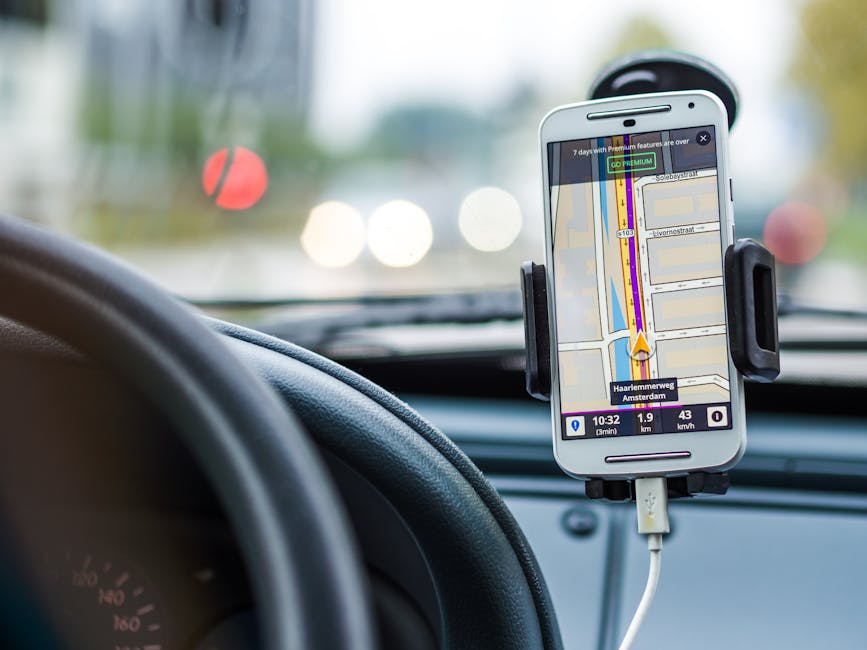
Optimising Mobile Site Speed

You’re likely losing sales because your mobile site is slower than your grandma’s gossip circle, and that’s a problem you can’t afford to ignore. A slow mobile site is like a salesperson who’s always running late – it’s a surefire way to send customers running to your competitors.
The solution lies in optimising your mobile site speed, and it’s easier than you think.
Mobile caching is like storing your most frequently used files in a super-accessible closet, so your site can load faster. When you implement mobile caching, your site doesn’t have to reload entire pages every time a user visits. It’s like having a VIP pass to the fast lane – your site loads faster, and your customers are happier.
Image-heavy pages are another culprit of slow mobile sites. You know, those gorgeous product images that take forever to load? Yeah, those ones. Image compression is the solution you’ve been searching for. By compressing your images, you reduce the file size, making them load faster without sacrificing quality. It’s like having your cake and eating it too – your site looks great, and it loads fast.
Simplifying Mobile Navigation
Browsing your mobile site is like trying to find your way out of a crowded mall on Black Friday – it’s a nightmare that leaves customers frazzled and frustrated. You’ve got a small screen, slow loading times, and a menu that’s more confusing than a calculus problem. It’s no wonder customers are abandoning their carts left and right.
The solution? Simplify, simplify, simplify! You need a menu hierarchy that’s easy to explore, not one that requires a PhD in computer science. Think of it like a file cabinet – you’ve got your main folders (categories), and then your subfolders (subcategories). Easy peasy, right? This way, customers can find what they’re looking for in two clicks or less.
And let’s talk about gesture controls. You know, those intuitive swipes and taps that make browsing your site a breeze. Implementing gestures like pinch-to-zoom, tap-to-zoom, and swipe-to-scroll can make all the difference. It’s like having a personal shopping assistant, minus the annoying small talk.
Enhancing Mobile Product Pages

Your mobile product pages are a hot mess, with tiny product images, lacklustre descriptions, and calls-to-action that are about as clear as a muddy puddle. It’s time to tidy up and make some serious improvements. Here’s where to start:
| Mobile Product Page Element | Do This Instead |
|---|---|
| Tiny, low-res product images | Use high-quality images that showcase the product from multiple angles |
| Lacklustre product descriptions | Write concise, engaging descriptions that highlight key features and benefits |
| Unclear calls-to-action | Use prominent, clear CTAs that encourage customers to add to cart or buy now |
| No social proof | Display customer reviews and ratings to build trust and credibility |
| Slow loading times | Optimise images and compress files to guaranty lightning-fast loading |
Streamlining Mobile Checkout Process
Now that your mobile product pages are finally worth looking at, it’s time to tackle the real culprit behind abandoned carts: a checkout process that’s about as smooth as a bumpy road.
You’ve got your customers all excited about that new pair of sneakers, and then – BAM! – you hit them with a checkout process that’s longer than a Netflix series marathon.
You need to streamline that checkout process, pronto! Think about it: would you want to fill out a bunch of forms on your tiny phone screen? Didn’t think so.
Make it easy for your customers by offering Guest Checkout – no need to create an account, no need to remember yet another password.
And while we’re at it, why not integrate Mobile Wallets like Apple Pay or Google Pay? It’s like having your customers’ payment info on speed dial.
Providing Mobile-Friendly Content

You’re one thumb swipe away from losing a potential customer if your content doesn’t fit their tiny screen. Yep, it’s that serious. Mobile shoppers are a finicky bunch, and if your content doesn’t make the cut, they’re gone. Poof! Vanished into the depths of the internet.
So, what makes mobile-friendly content? Let’s break it down:
| Content Type | Mobile-Friendly Tip | Why It Matters |
|---|---|---|
| Text | Use clear headings, short paragraphs | Easy to scan on small screens |
| Images | Optimise images for web, compress files | Fast loading times = happy customers |
| CTAs | Make ’em big, make ’em bold | No missed clicks or taps! |
| Videos | Keep ’em short, caption ’em | Engage on-the-go shoppers |
| Navigation | Simplify menus, reduce clicks | Less is more on mobile |
It’s all about content readability, folks! You want your mobile shoppers to glide through your content like a hot knife through butter. Image optimisation is key, too. No one likes waiting for a slow-loading image to, well, load. Make it snappy, and you’ll keep those customers hooked. Remember, every second counts – literally. So, get your mobile-friendly content in cheque, and watch those sales roll in!
Conclusion
You’ve made it this far, congrats!
Now, get to work on enhancing that mobile shopping experience for your e-commerce store.
Remember, 79% of online shoppers who are dissatisfied with a site’s mobile experience will never return.
Yeah, that’s a lot of lost sales.
Don’t be that site.
Contact us to discuss our services now!